Intro
The Lit Share Modal v3 is a tool for creating access control conditions for securing content with Lit Protocol. Click here to visit the Lit Protocol developer docs.
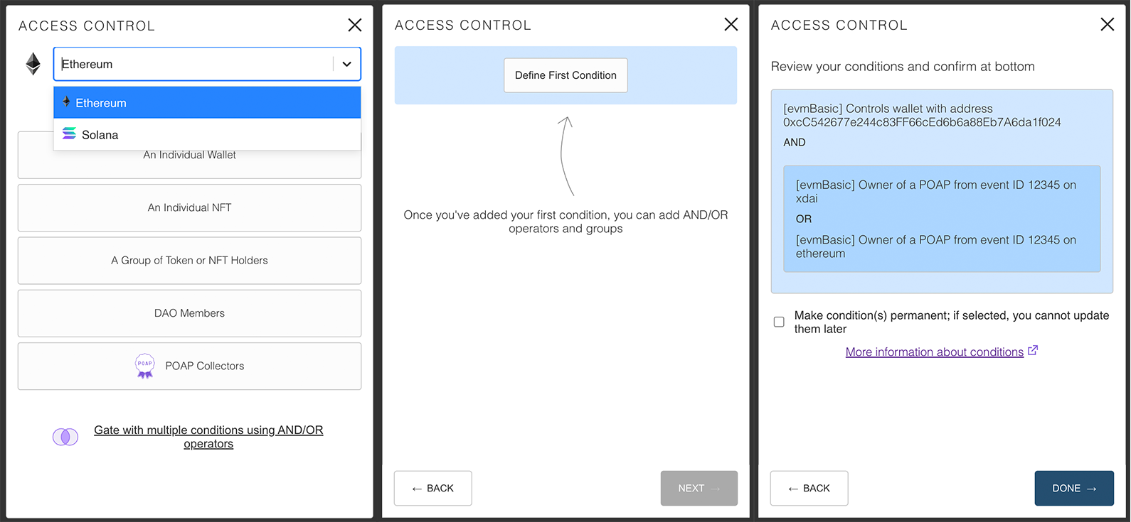
- Secure content based on wallet address, token/NFT holdings, POAP ownership, or DAO membership.
- Create multiple paths for unlocking content by using AND/OR operators.
- Set your most used tokens/NFTs as defaults for quick and easy access.
Note for NextJS users: If you are using NextJS, the CSS injection will not work. Set the injectCSS prop to false,
and
import the CSS file directly from node_modules/lit-share-modal/dist/style.css in _app.tsx or _app.jsx.
Installation
with npm
npm install --save lit-share-modal-v3
with yarn
yarn add lit-share-modal-v3
Usage
with React Hooks
Despite being called a modal, modal functionality is not included in this package in order to give developers maximum flexibility over implementation. Lit Share Modal can be used in modal form or embedded in a page. An example of both is provided below.
as a modal
import ShareModal from 'lit-share-modal-v3';
import { useState } from 'react';
import './App.css'

const App = () => {
  const [showShareModal, setShowShareModal] = useState(false);

  const onUnifiedAccessControlConditionsSelected = (shareModalOutput) => {
    // do things with share modal output
  }

  return (
    <div className={'App'}>
      <button onClick={() => setShowShareModal(true)}>
        Show Share Modal
      </button>

      {showShareModal && (
        <div className={'lit-share-modal'}>
          <ShareModal
            onClose={() => {
              setShowShareModal(false);
            }}
            onUnifiedAccessControlConditionsSelected={onUnifiedAccessControlConditionsSelected}
          />
        </div>
      )}
    </div>

  );
}

export default App;

// CSS in App.css

.lit-share-modal {
  width: 500px;
  height: 700px;
  position: absolute;
  left: 50%;
  top: 50%;
  transform: translate(-50%, -50%);
  border: 1px solid #333;
  border-radius: 0.25em;
}
as embedded content
import ShareModal from 'lit-share-modal-v3';

const App = () => {
  const onUnifiedAccessControlConditionsSelected = (shareModalOutput) => {
    // do things with share modal output
  }

  return (
    <div className={'App'}>
      <ShareModal isModal={false}  // use isModal to hide or display the close modal icon
                  onUnifiedAccessControlConditionsSelected={onUnifiedAccessControlConditionsSelected} />
    </div>

  );
}

export default App;
Props
Required
onClose- only necessary for modal format. Callback for actions to take on closing the modalonUnifiedAccessControlConditionsSelected- callback for the share modal output
onUnifiedAccessControlConditionsSelected provides an object with the following properties:
unifiedAccessControlConditions- an array of objects and nested arrays reflecting the selected conditionspermanent- a boolean signaling whether conditions will be permanent (true) or editable by the author in the future (false)
Documentation on how these properties are used with the LitJsSdk, can be found in
the LitJsSdk docs
Optional
Behavior Props
Behavior props allow high level control of the share modal. e.g. passing defaultChain={solana}
and chainsAllowed={['solana']} will prevent access to EVM chain conditions and allow only the creation of Solana
conditions.
defaultChain-ethereumby default. A string can be passed in any of the chains listed in the Usable Chains section.chainsAllowed- all chains in the Usable Chains section below are included by default. An array can be passed in with specific values to limit the options. e.g. passing in['ethereum', 'polygon']would let users only select Ethereum or Polygon.allowChainSelector-trueby default. Setting asfalsewill prevent users from switching between different chain conditions types e.g. switching from Ethereum to Solana.allowMultipleConditions-trueby default. Setting tofalsewill disable the multiple conditions screen and only allow the creation of single control conditions.permanentDefault-falseby default. Setting totruewill check by default the box that makes conditions uneditable.isModal-trueby default. Setting tofalsewill hide the close icon in the header.defaultTokens- set quick access tokens that appear in theSelect a Token/NFTmenu. More information can be found below in thedefaultTokenssection
Initial State Props
Initial state props control the initial state a user encounters upon mount. Props are evaluates in the same order as listed below.
injectInitialState-falseby default. Must be set totrueto use initial state conditions. None of the following props (basically anything starts with the wordinitial) will register unless this is set totrueinitialUnifiedAccessControlConditions- accepts aunifiedAccessControlConditionsobject (more information here) . If no other initial state conditions are used, the modal state will default to the editor mode on the multiple condition flow.initialFlow- points tosingleConditionby default. Accepts a string, eithersingleConditionormultipleConditions. Initial share modal state will reflect that prop. More information is available below.initialCondition- accepts a string to set the initial condition. Different chains have different condition options available. More information is available below.initialState- accepts an object with properties included to the desired condition type. More information regarding individual condition fields is available below.
Additional Props
darkTheme-falseby default. Setting astrueto enable dark mode.allowDevMode-falseby default. Setting totruewill show logs if there are prop type errors and enable the ability to see the raw access control conditions in JSON format.injectCSS- a boolean that is set to true by default. When this is true, the CSS styles will be injected into the<head>tag of the page when it loads, so there is no need to import any css. You can set this tofalseif you want to use your own CSS. For small changes, it's recommended to use thecssSubstitutionobject instead.cssSubstitution- empty object by default. Allows pinpoint the customization of different components in the share modal. More documentation will be available soon.
Prop references
Usable Chains
For use with the defaultChains and chainsAllowed props. Pass the value as a string into the respective props to
set
them. defaultChain accepts a string, chainsAllowed accepts an array of strings.
Chain values
| Chain Name | Chain Value |
|---|---|
| Ethereum | ethereum |
| Polygon | polygon |
| Fantom | fantom |
| xDai | xdai |
| Binance Smart Chain | bsc |
| Arbitrum | arbitrum |
| Avalance | avalanche |
| Avalanche FUJI Testnet | fuji |
| Harmony | harmony |
| Kovan | kovan |
| Goerli | goerli |
| Ropstein | ropstein |
| Rinkeby | Rinkeby |
| Cronos | cronos |
| Optimism | optimism |
| Celo | celo |
| Aurora | aurora |
Example of setting Polygon as the default chain, and allowing Polygon, Ethereum, and xDai as options
  <ShareModal
    defaultChain={'polygon'} // pass as single string
    chainOptions={['polygon', 'ethereum', 'xdai']} // mix of values listed above passed as an array of strings
    onClose={() => {
      setShowShareModal(false);
    }}
    onUnifiedAccessControlConditionsSelected={onUnifiedAccessControlConditionsSelected}
  />
defaultTokens prop
Defines tokens at the top of the select menu for easy access. LitGate is included by default, but this list can be
customized by passing an array of objects with the following properties:
label- name of token/NFTlogo- url of token/NFT faviconvalue- token/NFT addresssymbol- token/NFT symbolstandard- token standard (ERC20, ERC721, or ERC1155)
Example of a single entry quick access array
export const defaultTokens = [
  {
    label: "Lit Genesis Gate",
    logo: "https://litgateway.com/favicon.png",
    value: "0xA3D109E28589D2AbC15991B57Ce5ca461Ad8e026",
    symbol: "LITGATE",
    standard: "ERC721",
  }
];
initialFlow, initialCondition, and initialState props
initialFlow, initialCondition, and initialState are technically independent, but can be used together to finely
tune the initially rendered state.
initialFlow - defines whether the modal starts in the single condition or multiple conditions flow. Single condition
is default, but can be set to multipleCondition to begin in the multiple condition edit screen.
initialCondition - passed as a string which renders the respective individual control condition upon startup. Each
chain can use a different variety of values that reflect the conditions available.
Ethereum, and Gnosis (formerly xDai):
| Condition Type | Value passed to initialCondition prop as string |
|---|---|
| An Individual Wallet | wallet |
| An Individual NFT | nft |
| A Group of Token or NFT Holders | group |
| DAO Members | dao |
| POAP Collectors | poap |
Polygon, Fantom, BSC, Arbitrum, Avalanche, Avalanche FUJI Testnet, Harmony, Mumbai, Kovan, Goerli
, Ropstein, Rinkeby, Cronos, Optimism, Celo, and Aurora:
| Condition Type | Value passed to initialCondition prop as string |
|---|---|
| An Individual Wallet | wallet |
| An Individual NFT | nft |
| A Group of Token or NFT Holders | group |
| DAO Members | dao |
Solana
| Condition Type | Value passed to initialCondition prop as string |
|---|---|
| An Individual Wallet | wallet |
| An Individual NFT | nft |
| A Metaplex Collection | group |
initialState - an object that defines the individual form fields available within a given control condition.
Individual fields are optional, and those that are not included will be rendered empty as normal.
For EVM chains (Ethereum, Gnosis (formerly xDai), Polygon, Fantom, BSC, Arbitrum, Avalanche
, Avalanche FUJI Testnet, Harmony, Mumbai, Kovan, Goerli
, Ropstein, Rinkeby, Cronos, Optimism, Celo, and Aurora:)
An Individual Wallet

intialState = {
  address: // wallet address as string
}
An Individual NFT

intialState = {
  address: // ERC 721 NFT contract address as string,
  tokenId: // NFT token ID as string
}
A Group of Token or NFT Holders

intialState = {
  address: // token or NFT address as string,
  amount: // amount to own as string,
  contractType: // contract type, either 'ERC20', 'ERC721', or 'ERC1155',
  erc1155TokenId: // ERC1155 token ID as string.  Only necessary if contract type is `ERC1155`
}
DAO Members

intialState = {
  address: // DAO address as string,
}
POAP Collectors

can take either POAP Collection ID or POAP Name, not both.  POAP Name has an additional field 'matchCondition' that can be set to either 'contains' or 'equals'

for POAP Name:
intialState = {
  poapName: // name of POAP as string,
  matchCondition: // condition to measure against.  `contains` for contains value of `poapName`, or `equals` for equals exactly the value of `poapName`.  `contains` by default
}

for POAP ID:
intialState = {
  poapId: // POAP collection ID as string.  note: individual token ID will not work
}
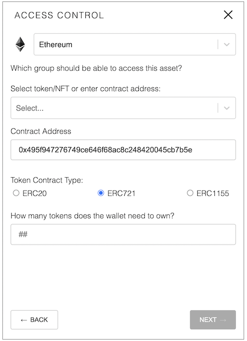
Initial props example
In this example, the share modal will be set to initially render in the multiple condition flow on the Group Token or NFT Holders condition with the Contract Address and Token Contract Type filled in, but the Amount field blank.
Note: the `amount` field is not included in the `initialState` object and will render like normal<ShareModal
injectInitialState={true}
initialFlow={'multipleConditions'}
initialCondition={'group}
initialState={
address: '0x495f947276749ce646f68ac8c248420045cb7b5e',
contractType: 'ERC721'
}
/>
Result of initial state upon opening the Share Modal: